When furnishing a home, each element must be chosen carefully to create an environment that reflects your style and is at the same time harmonious. Paintings, especially those of great artistic value such as the 3D reproductions of Materico.it, are a focal point of the furniture, but their placement and integration within the environment are equally important. The 60-30-10 rule is a fundamental tool for creating a chromatic and visual balance, and in the specific case of works of art, it can help you understand how to best arrange them in a room.
What is the 60-30-10 rule in home decor?
The 60-30-10 rule is a formula used to balance colors within a space. It is based on three percentages:
- 60%: The main color that should dominate the room. It is usually a neutral and sober color that covers most of the surfaces, such as walls, floors and main furniture.
- 30%: The secondary color that complements the main color. This color is used to complement the environment and is applied to fabrics, curtains, upholstery and some furnishings.
- 10%: The accent color, which adds vibrancy and contrast. It is the boldest color and is applied in small quantities, for example in decorative objects, cushions, vases and, of course, in paintings.
When using this rule in decor, the goal is to create a space that is visually balanced and pleasing without being too monotonous or too chaotic. But how do you properly fit paintings into this formula? Let's find out together.
1. The 60-30-10 rule applied to paintings
Paintings, especially those with a 3D effect like those from Materico.it, can play a crucial role in creating the element of contrast and visual interest in an environment. The integration of paintings follows the same logic as the 60-30-10 rule:
- 60% – Neutral Wall Color: The walls are the foundation of the space and make up 60% of the visual space. To integrate artwork with the 60-30-10 rule, start by choosing a neutral wall color, such as white, light gray, or beige. These colors provide a perfect backdrop to showcase artwork without distracting the eye.
The 3D effect artistic reproductions of Materico.it, for example, benefit the most from this type of neutral background. The three-dimensional effect, which makes the brush strokes and details of the works even more alive and real, is better visible when it is not “covered” by too strong or loud tones.
- 30% – Secondary Color: The secondary color is one that adds vibrancy and contrast, but does not overshadow the main color. In this case, the secondary color could be represented by furniture, fabrics (such as curtains and rugs) and other accessories. If the paintings are characterized by very bright colors or detailed shading, the secondary color could be used to complement the palette of the painting.
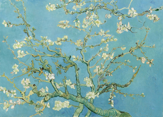
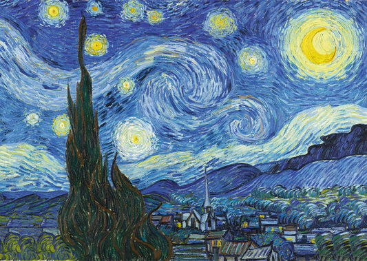
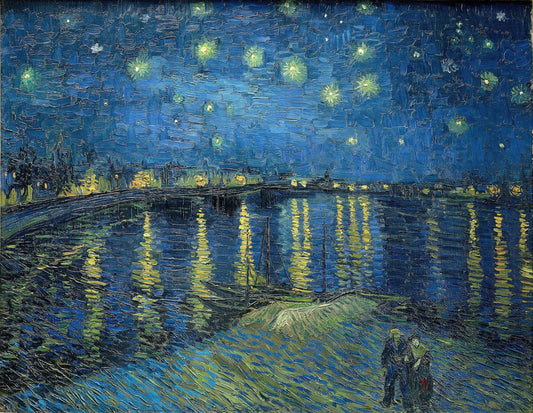
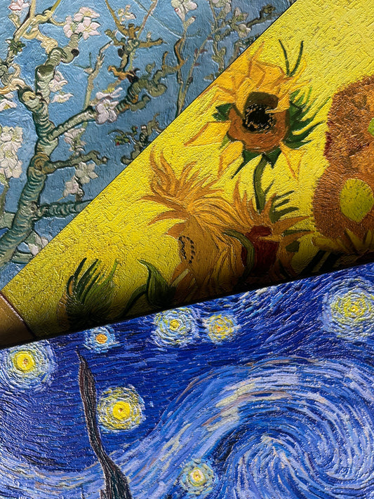
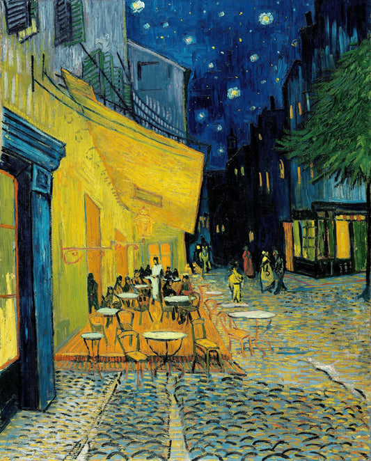
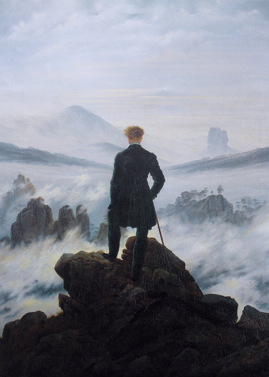
For example, if your Van Gogh 3D art reproduction features shades of blue and yellow, you can choose a secondary color such as a warm gray or a darker blue for the pillows, armchairs, or a bookcase. This not only reinforces the colors of the painting, but maintains visual harmony.
- 10% – Accent Color: Finally, the accent color is what adds personality and contrast to the room. Paintings can be perfect for this role. If your room is dominated by neutral and secondary colors, a piece with a visible contrast of colors – for example, a painting with shades of red, green or gold – can represent the accent color.
Materico.it's 3D effect art reproductions, thanks to their depth and relief that simulates the touch of a brush, are ideal to work as accent pieces that immediately capture attention. Choose a wall on which the painting becomes the protagonist, creating a sense of movement or energy in the environment.
2. The importance of the 3D effect in the integration of paintings
Materico.it stands out for its quality artistic reproductions, with a 3D effect that adds a unique tactile and visual dimension to the art. This effect not only enhances the painting, but offers a new sensory experience that can completely transform a room. When choosing a 3D painting, consider how its depth can interact with the other elements of the room.
For example, a 3D work can draw attention to a specific area of the room, creating a visual focal point. In this case, the painting becomes even more important in the context of the 60-30-10 rule, as it represents the element of maximum contrast. Its visibility will be accentuated by the choice of neutral and secondary colors that support it.
3. The integration of paintings into different furnishing styles
Each furnishing style has its own peculiarities, and the 60-30-10 rule can be easily adapted to different design trends, incorporating the artistic reproductions of Materico.it:
-
Modern style: In a minimalist space, with clean lines and neutral colors, paintings can be the central element, where the 3D effect stands out for its elegance and contemporaneity. The use of furniture in dark or metallic tones will help balance the effect of the painting.
-
Industrial style: Here, the contrast of stronger colors and the use of raw materials goes well with paintings that have a strong visual impact. The colors of the painting can be integrated with the secondary color in more robust furnishings, such as dark wood or metal furniture.
-
Shabby chic or rustic style: In warmer environments, where wood and pastel colours predominate, artistic reproductions with a 3D effect can add an extra dimension without compromising the welcoming atmosphere.
4. Practical examples to integrate the tables with the 60-30-10 rule
Here are some practical examples of how you can apply the 60-30-10 rule using Materico.it's 3D effect art reproductions:
-
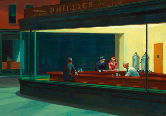
Living room: In a living room with beige walls (60%), choose sofas in neutral tones or a light gray (30%) and a Van Gogh painting in shades of blue and yellow (10%) as the focal point.
-
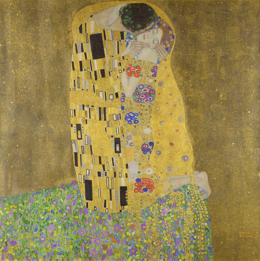
Bedroom: For a room with white walls and light gray bedding (60%), add a dark wood bookcase or green accents (30%), and a Claude Monet work with soft, thoughtful colors as an accent (10%).
-
Study: In a work environment with light gray walls (60%), modern black or wooden furniture (30%) and an abstract work with bright, contrasting colors as an accent element (10%).
Conclusion
Integrating paintings into your decor by following the 60-30-10 rule is a great way to create balanced, stylistically coherent spaces.
Materico.it 's artistic reproductions, with their 3D effect, are ideal for adding depth and personality to the room, becoming a focal point that attracts attention without overwhelming the surrounding environment.
By following this rule, you can get a room that not only respects your style, but also expresses your love for art, in a harmonious and functional context.